General chart FAQ & Tutorial
This FAQ gives you help that applies to all the AWN synoptic charts. Further help that is specific to individual charts is given in Help for this chart on each chart's home page.
First, some warnings
These charts are provided for interest only and are no substitute for professional weather maps provided by national meteorological services. While the AWN charts provide more observational detail than most "weather maps" on the web, they suffer several deficiencies:
-
The charts only provide isobars, isotherms, isohyets etc. for the data that you can actually see on the map. There is, for example, no or limited data provided over ocean areas, so the isopleths there may be completely wrong. Charts produced by national meteorological services such as the Bureau of Meteorology fill in these gaps between land-based observations by the crafty use satellite imagery, comparison with recent charts, aircraft and drifting buoy observations and more.
-
The 3-hourly Australian synoptic charts progressively fill with data as the relevant clock time occurs in each state, so there are times when the same situation applies to land areas as to water areas. Similarly, the first runs of the international charts will give a poor analysis over ocean areas. The last run of each international chart, about 3 hours after observation time, includes buoy data which may marginally improve the analysis. Don't believe any isopleths (the lines on the charts) unless you can see data around them.
-
The data is as received in real time from the Bureau of Meteorology or other national meteorological services. There has been no quality control, other than that provided at point of entry by the service or its observers. There will be errors, the most obvious of which will show up in the isobars if a pressure reading is wrong. If a cyclone appears to be bearing down on Alice Springs, or if there's a persistent low over Bourke, chances are that it's a single wrong pressure reading, or a systematic error affecting repeated readings.
-
Be sure to check the date/time on the actual chart. This is an experimental service subject to lots of variables (data flow, computer networks, functioning of the Digital Atmosphere program that prepares the charts) and stoppages do occur. Always check the time/date stamp (UTC) at the top left corner before using any chart. The time the chart depicts is also given in UTC in the bottom left corner. Current time (UTC), according to your computer, is shown at the top of this page.
I know what a chart is, but what is a synoptic chart? "Synoptic" comes from the word "synopsis" which means a condensed or concise version or outline of something. It comes from the Greek sunopsis meaning "general view". In meteorology, synoptic charts give a birds eye view of the weather over a wide area at a particular moment in time in a way that is concise, but still gives all the information needed to visualise the weather at any given place. They have been one of the most important tools of professional meteorogists for over a century.
What does it show? Much, much more than the usual weather map shown on TV or the Internet which usually show only a very simple analysis of fronts, pressure systems and, possibly, isobars and simple wind information. The AWN synoptic charts mostly show:
| Pressure systems | Highs and lows with central pressures |
| Isobars | Lines of equal pressure (red) |
| Isotherms | Lines of equal temperature (green) |
| Wind streamlines | Lines that show the wind flow across the area on the map (grey) |
| Station plots | These are what distinguish a true synoptic chart from a weather map. Each AWN synoptic chart features dozens to hundreds of clusters of information that give detailed weather observations from meteorological stations on the ground. Once you learn to read these, your eye can pick out both the general patterns and specific details of weather across a broad area -- all from the one map. |
Why would I use them? Lots of reasons. Here are a few:
- Being able to look at actual weather analysis and reports over a wide area on a map, instead of in a list, gives you a much better appreciation of the weather at a particular time at the surface where humans experience it. You don't have to know the geographic locations of places, because they're plotted on a map.
- The station plots always place the same type of information in the same place relative to the circle that represents the station, so you can scan the map and use your eyes to filter just the type of information you want. For example, 24-hour rainfall is always plotted in the 8 o'clock position relative to the circle, so you can run your eyes over the plots just looking for that piece of information.
- Like a professional meteorologist, you can peform your own analysis, looking for fronts and airmasses, broadscale changes and local variations.
- If you read in the press of a particular weather event and want to find out more detail, the AWN one-month archive allows you to go back to the relevant charts for the time and location. If, for example, there has been major flooding in SW France, go to the Iberia - France - Low Countries homepage and open charts for the particular date in the Chart Archive. These will show you the meteorological situation at the time as well as giving detailed weather observations from a dense network of stations.
- The synoptic charts show plots for thousands of locations worldwide, so if you want to check the weather in your favourite location or see how the weather is turning out for your friends on holidays in Argentina, all you need is to be able to find the location on a map.
How do I navigate around the maps? You can navigate the maps in two ways - use the Quick Access Hourly Charts table on the main index page, or go to the home page for each individual chart. The Quick Access Hourly Charts table is, as it says, quick, but only gives access to the hourly charts for the past 24 hours. Instructions for how to use it are on the main index page. Use the home page for each individual chart if you want more information, a denser network of station plots, and access to the one-month archive. Here's how to navigate a specific chart home page.
 |
Firstly, you have three sets of menus to other charts and documents. Secondly, you have two sets of menus for the charts themselves: Finally, template 7 is always in front of you to help interpret the station plots on the map. |
Some tips and tricks:
- Note the UTC in the Time site last updated bar on the home page or main index page before you begin using the charts. You will find it useful.
- There are two dates/times of importance when using a chart: the valid time and the generated time. Valid time is the date and time the chart represents. Generated time is simply the date and time the chart was created by the computer. So you might say "this chart is for 11.00 on 27 September 2010 that was generated at 11.37 on 27 September 2010." Make it a habit, when you open every chart, to check that the time/date on the Generated tag in the top left corner is not earlier than the chart's valid time. It can be minutes, hours or even days later, but never earlier. The hourly charts will normally be 10 to 50 minutes behind valid time, and archive charts will normally be 3 to 4 hours behind. If generated time is a lot later than valid time, it just indicates I have re-run this chart because of some problem. However, if the generated time is earlier than the valid time, especially by a day or a month, you are looking at an old chart. I don't know how many times I have struggled to understand an apparently nonsensical chart only to realise after a while that it is yesterday's, not today's.
- If the size of the chart that opens in window 6 is too small for you, right click the link in menus 4 or 5 and select Open in new window/tab. You can grab even more of the screen by pressing the F11 key (press Esc or F11 again when you want it back to normal).
- These charts are BIG (they have to be to fit in many, many observations in populous areas). So how do you compare or animate several charts? First open them in their own windows or tabs. What you do next depends on your browser. Some browsers (e.g. Google Chrome) shrink the initial image to fit the screen and allow you to click on part of the image to expand to full size. For these browsers, simply click on some feature that is identical in each chart. Other browsers upen the image full sized and you must use the vertical or horizontal scroll bars to move around. For these browsers, clicking the same number of times to the left/right or top/bottom of these scroll bars for each image will align all the charts.
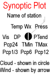
What do the station plots show? Depending on the station and the time of observation, they show the name of the station, cloud amount and type, what weather is happening, wind direction and speed, barometric pressure and tendency (up, down or steady and how much), temperature, maximum and minimum temperature, dew point, visibility and rainfall. That's a lot to pack in a plot that would fit under a 10c piece, so there's a standard place in the plot for each piece of information, and some symbols are used. The standard plot model relevant to the chart is shown on the left side of each chart's home page (there are some minor variations from region to region) and below is a walk-through, complete with examples, working clockwise around the plot from the top. Keep referring to the Synoptic Plot model and examples in the left column as you read along.
|
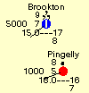
Cloud | The location of the weather station is shown by a circle, and how much this circle is filled in shows how much the sky is covered by cloud. In the examples at left, Perth has 3/4 cloud cover, Brookton is nearly overcast and Pingelly is overcast. Katanning has a cross in its circle, indicating it's an automatic station that doesn't report cloud. But wait, there's more. Underneath the circle there may be a symbol indicating the type of low-level cloud. Perth has large cumulus (indicating thunderstorms may be building) while Brookton and Pingelly have low gloomy stratus. All these symbols are given in the Symbol Reference - see below. | ||||
| Name of station | Pretty obvious, but because of the tight space you only get the first 10 characters of the name. So in the examples, Brookton, Pingelly and Katanning are spelt out in full, but Perth Airport has lost its "ort". Many international stations are at airports, and their names are written "city/name of airport", e.g. London/Heathrow which would appear as "London/Hea". | |||||
| Wind | Is shown by a shaft attached to the circle that points into the circle in the direction the wind is blowing from. So at Perth Airport, the wind is west-south-west, and in the Synoptic Plot model it is northeasterly. Wind speeds are shown to the nearest 5 knots by barbs or pennants at the end of the shaft - a full length barb for every 10 knots and a half length barb for 5 knots. So Perth and Katanning have 10 knots wind, Brookton and Pingelly are 1 or 2 knots and the wind in the plot model is 15 knots. See below for more. | |||||
| Wx | If there's a symbol at 12 o'clock, directly above the station circle, then the station is reporting weather other than fine at the time of observation. Symbols are used covering a huge variety of weather found around the world (see below). Perth is reporting rain (a dot) in the area (i.e. surrounded by brackets), Brookton has continuous moderate drizzle (commas), and Pingelly intermittent light rain (a single dot). We're not sure what's happening weatherwise at Katanning as it's an auto station, though some auto stations do report weather types. | |||||
| Press PTend |
Three pieces of information about barometric pressure are reported at 2 and 3 o'clock to the circle. First the barometer reading to one decimal place, but without the thousand or nine-hundred figures. So Perth's pressure (089) is 1008.9 hectopascals and Katanning (096) 1009.6. If you saw "867" here, it's more likely to be 986.7 than 1086.7 which would be record-breaking high pressure. Perth also shows "19" and a symbol showing a barograph (recording barometer) trace over the past 3 hours. The symbol shows the pressure has fallen a little, then risen much more, and the "19" tells us the net increase for the 3 hours has been 1.9 hectopascals. More on the symbols below. Brookton and Pingelly don't have barometers, so these spaces are blank, as is the tendency space for Katanning. |
|||||
| TMax TMin |
OK, getting much easier now. The figures at 4 and 5 o'clock from the circle are the maximum and minimum temperatures in the past 24 hours. Perth's top was 19C and low was 11C. Katanning has no figures here showing they're not being reported at this observation. Max and min temperatures are usually only reported once a day, and the times they appear on synoptic charts varies around the world - see Help for this chart on each chart's home page for details. | |||||
| Pcp | The figures at 6, 7 and 8 o'clock from the circle all represent rainfall for different periods up to the time of observation. What is reported, and in which position, varies widely around the globe - see Help for this chart for each chart. Perth has had 26.0mm in the past 24 hours, while Katanning has had 0.6mm since the last 24 hour observation time (9am in Australia) of which 0.4 fell in the last hour. See Help for this chart for each chart to see what gets reported and when. | |||||
| Vis | The outer figure at 9 o'clock is visibility in metres up to 5km, and in kilometres above 5km. So Perth is reporting 15km, Brookton 5000m (5km) and Pingelly 1000m (1km). If there's no figure here (e.g. Katanning), either this is an auto station that doesn't report visibility, or the visibility is so good that it's not worth reporting. | |||||
| Temp DP |
Finally temperature (at 10 o'clock) and dew point (the inner figure at 9 o'clock). They are both in whole degrees Celcius and the lower the difference between them the more humid it is. |


Phew! That sounded like an awful lot, but you'll be surprised at how little practice (and reference back here when you need it) is required to read the weather very quickly for any location, compare locations across an area, and look for changes, similarities, and what the weather is doing at your favourite holiday location.
Tell me more about the way wind is shown. This diagram (thanks to Joseph Bartlo) may help:

If the wind is between 1 and 2 knots, a shaft is shown without feathers. If the wind is calm, no shaft is shown.
What do the symbols used in station plots mean? Symbols are used for weather, low cloud and pressure trend. You'll find them in this separate help screen which you can open over a map and keep handy for reference, or print out. The weather symbols are in rising order of severe weather, going from smoke haze all the way up to severe thunderstorm with hail. Although there seem to be a lot of symbols (nearly a hundred, actually), you'll find there is a logic to them. For example, rain is a fat dot, drizzle a fat comma, snow an asterisk, while a thunderstorm is a T with lightning coming out of it. I have used colour coding to visually group symbols for like weather to make it easier to learn the symbols.
Why are some plots black, some blue and some red? These give a rough indication of where significant weather is occurring, and are based on the aviation legal definitions for the weather conditions for Visual Flight Rules (VFR), Marginal Visual Flight Rules (MVFR) and Instrument Flight Rules (IFR). VFR (black plots) indicate cloudbase is 3,000 feet or greater AND visibility is 8km or greater. IFR (red plots) indicate cloudbase is less than 1,000 feet AND/OR visibility is less than 5km. MVFR (blue plots) indicate cloudbase AND/OR visibility fall in between Instrument FR and Visual FR. NOTE that many Australian automatic stations do not report either visibility or cloudbase. If these measurements are missing, the plot will be black.
Why do some plots have circles and some have squares? A square plot tells you the observation is completely from an automatic station. Circles can be automatic or manned stations, or a combination of both (e.g. automatic temperatures and pressure, manual observation of visibility and cloud).
The times keeps referring to "UTC". What is it? Why not use local time? UTC stands for Universal Time Co-ordinated, or Co-ordinated Universal Time which is almost identical to Greenwich Mean Time (GMT) and is often referred to as time zulu. So 0900 UTC = 0900 GMT = 0900Z. UTC officially replaced GMT in many countries from 1 January 1972 and is used widely by organisations and systems that are global in extent. And that brings us to the second question - why not use local time? The weather is global, and so meteorologists must use a global time system to work with it. Time zones introduce great complexities, especially where daylight saving or summer time is involved - just look at Australia which has only recently standardised the dates on which the states with daylight saving switch back and forth, and which still has 3 time zones in winter but 5 in summer (lots more, of course, if you include our islands and Antarctic territories).
All the AWN synoptic charts use UTC, though you will find the Eastern Standard Time and Western Standard Time conversions at the top of each time column. Also, this little table:
keeps appearing everywhere, letting you know the time the site was last updated in UTC as well as all current Australian time zones. As the site is updated every few minutes, this table lets you know the approximate time now in UTC. Finally, Help for this chart for each individual chart tells you which time zones are covered, and what the clock time would be in those zones.
How are the maps produced? AWN uses the program Digital Atmosphere, created by Tim Vasquez at Weather Graphics. Into this we feed Australian data from the Australian Bureau of Meteorology and international data that is provided by almost every country to the World Meteorological Organisation for distribution through its Global Telecommunications System. Our main international feeds are the US National Oceanic and Atmospheric Administration and a number of US university sites that distribute the data as a public service.
How accurate are they? Only as accurate as the data fed into the program! Each hour, over 10,000 station reports are processed, each containing a dozen or more pieces of information. Errors occur and, as the entire process is automated and operates in real time, they won't be picked up. For example, if a station reports a wrong pressure reading (e.g. 1108hPa instead of 1018), the isobars (red pressure lines) on the chart will show a bulls-eye of tight lines as they try to accommodate the incorrect reading. There will be errors, the most obvious of which will show up in the isobars if a pressure reading is wrong.
Secondly, many of the maps have areas of few or no observations, particularly over oceans or in countries where communications are difficult and data has not been received when the charts are produced. In these areas the pressure, temperature and wind analysis lines will be vague or completely wrong. Charts produced by national meteorological services such as the Bureau of Meteorology fill in these gaps between land-based observations by the crafty use satellite imagery, comparison with recent charts, aircraft and drifting buoy observations and more. Don't believe any isopleths (the lines on the charts) unless you can see data around them.
Third, Digital Atmosphere converts all station reports to a fairly coarse grid of data, then rounds this as lines are drawn, so sometimes the pressure or temperature indicated by the lines will differ from what's reported - the smaller the scale of the map, the greater the variation may be.
Finally, be sure to check the date/time on the actual chart. This is an experimental service subject to lots of variables (data flow, computer networks, functioning of the Digital Atmosphere program that prepares the charts) and stoppages do occur. Always check the time/date stamp (UTC) at the top left corner before using any chart. The time the chart depicts is also given in UTC in the bottom right corner.
Please allow for these deficiencies as you use the charts. They are no replacement for the detailed surface analyses produced by many national meteorological services (NMS). However, NMS charts are usually not available for several hours and the publicly available charts are seldom as detailed as AWN's synoptic charts. Links to NMS charts, where available, are given on the help page for each chart.